Tuesday 17 February 2009

Tal Rosner


Tal Rosner is a versatile practitioner who has worked from various mediums. He has studied graphic designing and after he got his degree, he moved on and worked for magazines and posters for three years. His interest grew in terms of design and wanted to achieve more. Therefore he turned to moving image in which he felt he had less limits and more possibilities. He wanted to translate his graphic design work in to the moving image which essentially would add a new dimension to his designs. Doppel Ganger was one of his early works which he produced in the final year of MA. Here we get to see numerous ideas blended in one short film. Very experimental, interesting and visually eye catching. The whole film was produced digitally and the process of making it was quite digital as well. Small hand held cameras were used in the process for maximum freedom and maneuverability. The budget was fairly limited so therefore some things he had to be compromised with. In 2004, he produced another short film called Docklands. It was filmed in South London. There was emphasis on repetitions and patterns hence the visuals were quite dynamic and clever. For example there's a bit where a train is going past the camera and what Rosner did was have the same shot flipped in to each other and therefore it looks like the train is going in to each other. Not only that, but this time around more shots were used and evidence of creativity and maturity could be witnessed within Rosner's work. His understanding of the genre seem to be growing with every film he created. He is self taught and learned things and techniques as he went along. He works with minimal crew and the reason is so that he will have full control over his film and therefore he will have the right results.
He prefers to work on a smaller scale as oppose to big. He feels that on a smaller scale, one has more control over the composition and it will be more successful in the end. His work was getting recognized and popular within the entertainment industry. He got commissioned to create a film for a classical music album which was quite different to what he is use to which is techno music. Over the years, Tal has produced his films using techno music and was not a accustomed to classical music at all. It was a big challenge for him but in the end he manage to pull it off and Abstractions is now known as Rosner's finest pieces. The music was quite fast and the pace also varied therefore, the images had more variation to them and again we got to see Rosner's ever growing understanding of the genre. After this, he got commissioned to produced visuals for the opening title of Skins. The budget was limited as it was only the first season for the series but he had more tools to play with and also had some good experience in the bag. The opening title was only few seconds long and had to represent each character quickly hence he used more effects than ever and manage to execute it at the same time. It was a success and was commissioned again for the later seasons for the series which followed after. Rosner's work is quite unique and exciting. He has grown as a designer which is evident in his work over the years he produced. It connects to the viewer and somehow keeps their attention with his wild visuals and attention to detail.

Sunday 15 February 2009


Very effective piece of composition. Even though it hasnt got the 3d element of Whadcock's work or the texture's of Parker's work it still manages to charm the observer with its clever composition and flat colours. Top stuff. It has helped me in my recent brief which was to produce a composition for KPMG, a business company. the composition is large scale and I feel his Whadcock's work has that simplicity and that impact which would be fitting on a large scale composition.

Scott Roberts


I am quite excited about Scott Robert's work. It is very clever and its simplicity adds to its visuall dominance. Its vector based art therefore the shapes and lines are accurate and crisp. The balance is well considered and so is the space. I will be keeping an eye on Scott's work

Very bright and colourful image. The obvious emphasis seems to be on colour and composition and visually makes it stand out. The colour combination is working well together and compliment the overall success of the image.

Valerie Pezeron


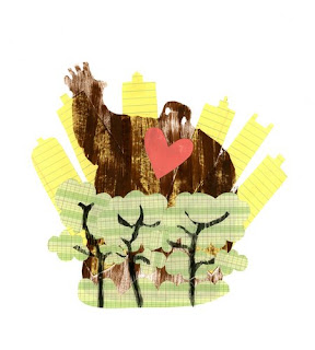
There are few different elements within this particular image. Combination of ink with digital media seems to have done wonders here. Feels like a collage but also gives an impression of a graphic design image at the same time. Quite exciting technique which I will definatly consider in my coming projects.

Sara Tyson


Sara's work has a different look as opose to other illustrators of more recent times. It is abstract and also seems to have cubist elements to it.

Very clever and well thought through piece. Colours are kept to the minimal which balances the overall composition.

Ian Whadcock


Whadcock's illustrations had cought my eye. There is an element of 3d and a sense of structure within some of his pieces. He mainly works digitally and therefore the composition is strong, bold and crisp.

The mediums play a vital role. In this particular image he has used acrlic and cut paper to achieve the effect he wants. Simple yet effective results

He uses signs and colour to emphasis his point he wants to make via his composition. An important factor in his style of work.

Tyler Parker


Tyler Parker's illustrations are quite interesting. Simplistic shapes combined with texture adds a new depth to the piece. It is quite influencial and therefore will be refering back to his images.

Wednesday 4 February 2009


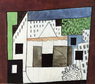
His idea for the Chinese costume for his parade. Very bright and colorful with simple Chinese patterns on top make it visually attractive.

Here it shows his idea in motion. The sketches help him work out the precise positions of the props and the backdrop.

His idea for the layout of the stage. Quite simple shapes have been used and color but its the idea which hes after.

PICASSO'S PARADE


Picasso has been an influential figure to many artists
Not only he has produced work on various scales but he also has produced work and ideas for theater.
I have looked at his theater work for my project and it has been most helpful in terms of fresh ideas and composition.

Tuesday 3 February 2009


Solid composition and beautiful patterns make up this image. The shapes are well realized therefore making the overall image successful.

Very effective image. White space is used well and the impact is more dramatic and effective.

Another example of human form acting more than what it represents. Very strong composition with strong colors adds to the impact made by the design. Here Matisse uses connotations and signs in order for the observer to connect to the piece. Red for example is representing heart as we know where its location is and the abstract human form emphasis on this. Very simple yet important technique, which ultimately helps the image communicate with the audience.

The main subject matter in this image is the human form. Its been drawn in an abstract form therefore it acts more that a subject matter and starts behaving more like a shape or pattern and becomes part of the whole composition.

The color combination is quite interesting to observe as they sit well together. Quite generic shapes have been used which adds to the charm of his style.

Matisse


Matisse has been an inspiration to many artists over the years. He has produced variety of work and his style has a unique distinction from other abstract artists. Shapes and space are used well within his compositions and manages to keep the visual language intact at the same time.
Leger has also produced work which has a 3d element to it. Very abstract and colorful which is why his designs work on a big scale.

One of his work on a big scale. Very solid piece of composition. Again bright and bold, which on a big scale is useful as it catches attention from a distance and can be understood easily.

Shapes and color compliment each other in this particular piece.

Very simplistic approach to his work. He uses the space wisely and the end product is visual master piece.

Fernand Leger


Fernand Leger is more or less ans abstract artist who has worked on big scale images for architecture. Quite bright use of colors and shapes. There isn't a particular subject matter in his work therefore it appeals to masses and it gives the observer the chance to imagine what he or she want the image to be.

Another one of Hepworth's pieces. Strong emphasis on bold shapes and structure.
Very bold and strong composition. although the structure of the sculpture is simple, she manages to achieve a sense of balance between the white and the blue and the shape itself.

Barbra Hepworth

I have been looking at numerous artists for my new brief. Barbra
Hepworth has been one of them. She mainly works with sculptures
on various scale from small pieces to monumental designs. Her sense of scale and composition is very strong and I personally have learned few things whilst researching her work.